In an internal memo placed on a public bulletin board, Lufthansa acknowledges that it "will work on an optimisation" following the initial findings from the flight operations with its rebranded aircraft. "Since our first two planes with the updated livery landed on many places of this world we noticed that for instance the blue plaint on the plane appears to be significantly darker than in the test environment - especially in adverse weather conditions," it reportedly said.
The new look has split opinion with many praising it for its simple and professional design, while others have complained about the change to the background of its iconic 100-year-old logo from yellow to blue, describing it as bland and uninspiring.
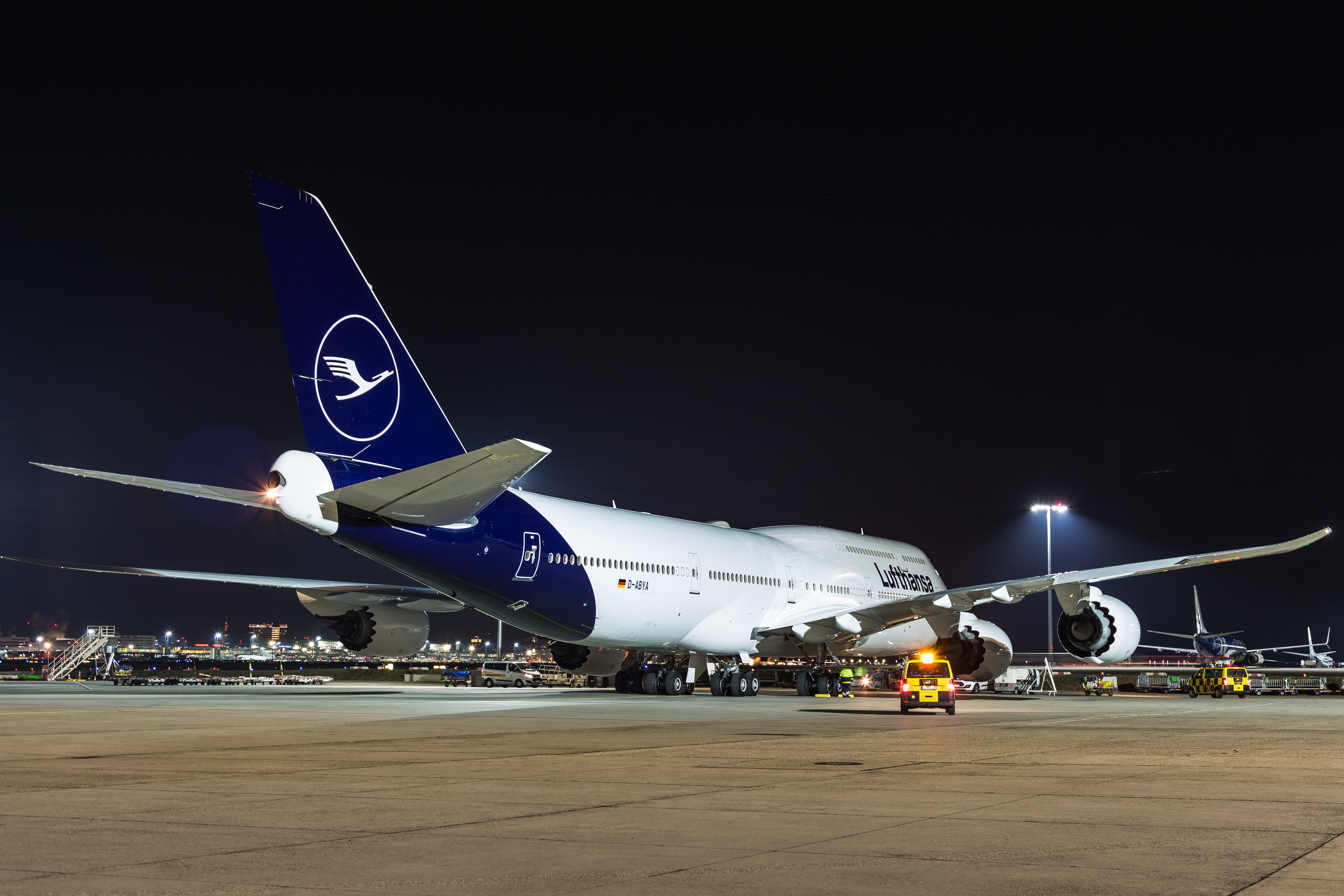
The famous stylised flying crane logo dates back to the late 1910s and was created by German architect and designer Otto Firle for Lufthansa's predecessor Deutsche Luft-Reederei (DLR). The yellow was introduced in the 1960s by graphic designer Otto "Otl" Aicher. The redesign, spearheaded by Lufthansa in-house designer Ronald Wild, will be introduced across the airline's 330+ fleet of aircraft over the next eight years.
The new look is described by Lufthansa as "heritage meets the future". Against the backdrop of digitalisation and changing customer requirements, Lufthansa says it "recognised that the company needed to modernise the aircraft appearance in order to remain up to date". As such it has reworked every detail of the design to meet requirements of the digital age.
"The new Lufthansa appearance gives the individual elements a new, modern quality to sharpen their impact. The designers found great importance in taking up the unique design tradition of the Lufthansa brand and leading it into the future," it says.
In its launch marketing material the new Lufthansa blue was described as the Lufthansa Group's main colour. It will be interesting to see how that blue changes in the coming months of whether the chance to 'optimise' the brand will lead to further changes. The internal memo says the airline is also working on a new version of the design that combines the Lufthansa word mark with the crane logo so additional changes will be seen. The big question is how exactly is Lufthansa defining the word 'optimise'?